|
|
| |
|
|
| |
|
|
| High and Low Temperatures |
|
| |
 Climate Change Indicators: High and
Low Temperatures Climate Change Indicators: High and
Low Temperatures
This indicator describes trends in unusually hot and cold
temperatures across the United States.
Key Points
Heat waves in the 1930s remain the most severe heat waves in
the U.S. historical record (see Figure 1). The spike in
Figure 1 reflects extreme, persistent heat waves in the
Great Plains region during a period known as the “Dust
Bowl.” Poor land use practices and many years of intense
drought contributed to these heat waves by depleting soil
moisture and reducing the moderating effects of evaporation.
Nationwide, unusually hot summer days (highs) have become
more common over the last few decades (see Figure 2). The
occurrence of unusually hot summer nights (lows) has
increased at an even faster rate. This trend indicates less
“cooling off” at night.
The 20th century had many winters with widespread patterns
of unusually low temperatures, including a particularly
large spike in the late 1970s (see Figure 3). Since the
1980s, though, unusually cold winter temperatures have
become less common—particularly very cold nights (lows).
The two maps show where changes in the number of days with
unusually hot (above the 95th percentile) and cold (below
the 5th percentile) days have occurred since 1948. Unusually
high temperatures have increased in the western United
States and in several areas along the Gulf and Atlantic
coasts, but decreased in much of the middle of the country
(see Figure 4). The number of unusually cold days has
generally decreased throughout the country, particularly in
the western United States (see Figure 5).
If the climate were completely stable, one might expect to
see highs and lows each accounting for about 50 percent of
the records set. Since the 1970s, however, record-setting
daily high temperatures have become more common than record
lows across the United States (see Figure 6). The most
recent decade had twice as many record highs as record lows. |
|
Background
Unusually hot or cold temperatures can result in prolonged
extreme weather events like summer heat waves or winter cold
spells. Heat waves can lead to illness and death,
particularly among older adults, the very young, and other
vulnerable populations (see the Heat-Related Deaths and
Heat-Related Illnesses indicators). People can also die from
exposure to extreme cold (hypothermia). In addition,
prolonged exposure to excessive heat and cold can damage
crops and injure or kill livestock. Extreme heat can lead to
power outages as heavy demands for air conditioning strain
the power grid, while extremely cold weather increases the
need for heating fuel.
Record-setting daily temperatures, heat waves, and cold
spells are a natural part of day-to-day variation in
weather. As the Earth’s climate warms overall, however, heat
waves are expected to become more frequent, longer, and more
intense. Higher heat index values (which combine temperature
and humidity to describe perceived temperature) are expected
to increase discomfort and aggravate health issues.
Conversely, cold spells are expected to decrease. In most
locations, scientists expect daily minimum
temperatures—which typically occur at night—to become warmer
at a faster rate than daily maximum temperatures. This
change will provide less opportunity to cool off and recover
from daytime heat. |
|
About the Indicator
This indicator examines trends in unusual temperatures from
several perspectives:
The size and frequency of prolonged heat wave events (Figure
1).
Unusually hot summer temperatures and cold winter
temperatures nationwide (Figures 2 and 3).
The change in the number of days with unusually hot and cold
temperatures at individual weather stations (Figures 4 and
5).
Changes in record high and low temperatures (Figure 6).
The data come from thousands of weather stations across the
United States. National patterns can be determined by
dividing the country into a grid and examining the data for
one station in each cell of the grid. This method ensures
that the results are not biased toward regions that happen
to have many stations close together.
Figure 1 shows the U.S. Annual Heat Wave Index, which tracks
the occurrence of heat wave conditions across the contiguous
48 states from 1895 to 2015. While there is no universal
definition of a heat wave, this index defines a heat wave as
a period lasting at least four days with an average
temperature that would only be expected to occur once every
10 years, based on the historical record. The index value
for a given year depends on how often heat waves occur and
how widespread they are.
Figures 2 and 3 show trends in the percentage of the
country’s area experiencing unusually hot temperatures in
the summer and unusually cold temperatures in the winter.
These graphs are based on daily maximum temperatures, which
usually occur during the day, and daily minimum
temperatures, which usually occur at night. At each station,
the recorded highs and lows are compared with the full set
of historical records. After averaging over a particular
month or season of interest, the coldest 10 percent of years
are considered “unusually cold” and the warmest 10 percent
are “unusually hot.” For example, if last year’s summer
highs were the 10th warmest on record for a particular
location with more than 100 years of data, that year’s
summer highs would be considered unusually warm. Data are
available from 1910 to 2015 for summer (June through August)
and from 1911 to 2016 for winter (December of the previous
year through February).
Figures 4 and 5 show how trends in unusually hot and cold
daily temperatures throughout the year vary by location.
These maps cover 1,100 weather stations that have operated
since 1948. Figure 4 was created by reviewing all daily
maximum temperatures from 1948 to 2015 and identifying the
95th percentile temperature (a temperature that one would
only expect to exceed in five days out of every 100) at each
station. Next, for each year, the total number of days with
maximum temperatures higher than the 95th percentile (that
is, unusually hot days) was determined. The map shows how
the total number of unusually hot days per year at each
station has changed over time. Figure 5 is similar except
that it looks at unusually cold days, based on the 5th
percentile of daily minimum temperatures.
Many people are familiar with record daily high and low
temperatures, which are frequently mentioned in weather
reports. Figure 6 depicts trends in these records by
comparing the number of record-setting highs with the number
of record-setting lows by decade. These data come from a set
of weather stations that have collected data consistently
since 1950.
Indicator Notes
Temperature data are less certain for the early part of the
20th century because fewer stations were operating at that
time. In addition, measuring devices and methods have
changed over time, and some stations have moved. The data
have been adjusted to the extent possible to account for
some of these influences and biases, however, and these
uncertainties are not sufficient to change the fundamental
trends shown in the figures.
Data Sources
The data for this indicator are based on measurements from
weather stations managed by the National Oceanic and
Atmospheric Administration. Figure 1 uses data from the
National Weather Service Cooperative Observer Network.
Figures 2 and 3 come from the U.S. Climate Extremes Index,
which is based on a smaller group of long-term weather
stations that are tracked by the National Centers for
Environmental Information and referred to as the U.S.
Historical Climatology Network. Figures 4 and 5 use data
from a somewhat larger set of stations tracked by the
National Centers for Environmental Information, known as the
Global Historical Climatology Network. Figure 6 uses
National Weather Service data processed by Meehl et al.
(2009).12 All of these weather station records are available
online at:
www.ncdc.noaa.gov, and information about the Climate
Extremes Index can be found at:
www.ncdc.noaa.gov/extremes/cei.
Technical Documentation
Download related technical information PDF |
|
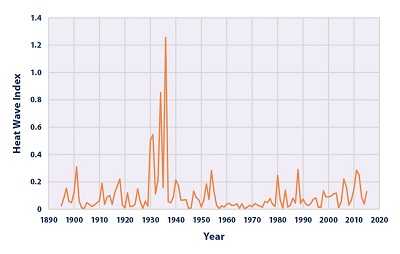 Figure
1. U.S. Annual Heat Wave Index, 1895–2015 Figure
1. U.S. Annual Heat Wave Index, 1895–2015
This figure shows the annual values of the U.S. Heat Wave
Index from 1895 to 2015. These data cover the contiguous 48
states. Interpretation: An index value of 0.2 (for example)
could mean that 20 percent of the country experienced one
heat wave, 10 percent of the country experienced two heat
waves, or some other combination of frequency and area
resulted in this value.
Data source: Kunkel, 20166 |
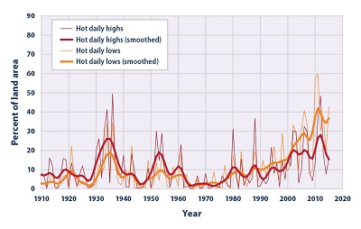 Figure
2. Area of Contiguous 48 States With Unusually Hot
Summer Temperatures, 1910–2015 Figure
2. Area of Contiguous 48 States With Unusually Hot
Summer Temperatures, 1910–2015
This graph shows the percentage of the land area of the
contiguous 48 states with unusually hot daily high and low
temperatures during the months of June, July, and August.
The thin lines represent individual years, while the thick
lines show a nine-year weighted average. Red lines represent
daily highs, while orange lines represent daily lows. The
term “unusual” in this case is based on the long-term
average conditions at each location.
Data source: NOAA, 20157 |
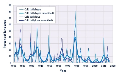 Figure
3. Area of the Contiguous 48 States With Unusually
Cold Winter Temperatures, 1911–2016 Figure
3. Area of the Contiguous 48 States With Unusually
Cold Winter Temperatures, 1911–2016
This graph shows the percentage of the land area of the
contiguous 48 states with unusually cold daily high and low
temperatures during the months of December, January, and
February. The thin lines represent individual years, while
the thick lines show a nine-year weighted average. Blue
lines represent daily highs, while purple lines represent
daily lows. The term “unusual” in this case is based on the
long-term average conditions at each location.
Data source: NOAA, 20168 |
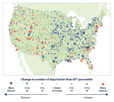 Figure
4. Change in Unusually Hot Temperatures in the
Contiguous 48 States, 1948–2015 Figure
4. Change in Unusually Hot Temperatures in the
Contiguous 48 States, 1948–2015
This map shows trends in unusually hot temperatures at
individual weather stations that have operated consistently
since 1948. In this case, the term “unusually hot” refers to
a daily maximum temperature that is hotter than the 95th
percentile temperature during the 1948–2015 period. Thus,
the maximum temperature on a particular day at a particular
station would be considered “unusually hot” if it falls
within the warmest 5 percent of measurements at that station
during the 1948–2015 period. The map shows changes in the
total number of days per year that were hotter than the 95th
percentile. Red upward-pointing symbols show where these
unusually hot days are becoming more common. Blue
downward-pointing symbols show where unusually hot days are
becoming less common.
Data source: NOAA, 20169 |
 Figure
5. Change in Unusually Cold Temperatures in the
Contiguous 48 States, 1948–2015 Figure
5. Change in Unusually Cold Temperatures in the
Contiguous 48 States, 1948–2015
This map shows trends in unusually cold temperatures at
individual weather stations that have operated consistently
since 1948. In this case, the term “unusually cold” refers
to a daily minimum temperature that is colder than the 5th
percentile temperature during the 1948–2015 period. Thus,
the minimum temperature on a particular day at a particular
station would be considered “unusually cold” if it falls
within the coldest 5 percent of measurements at that station
during the 1948–2015 period. The map shows changes in the
total number of days per year that were colder than the 5th
percentile. Blue upward-pointing symbols show where these
unusually cold days are becoming more common. Red
downward-pointing symbols show where unusually cold days are
becoming less common.
Data source: NOAA, 201610 |
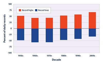 Figure
6. Record Daily High and Low Temperatures in the
Contiguous 48 States, 1950–2009 Figure
6. Record Daily High and Low Temperatures in the
Contiguous 48 States, 1950–2009
This figure shows the percentage of daily temperature
records set at weather stations across the contiguous 48
states by decade. Record highs (red) are compared with
record lows (blue).
Data source: Meehl et al., 200911 |
|
|
|
EPA Page |
|
This is the
EPA page for this topic. To see if the Trump
administration has changed the EPA page, simply click the
link and compare the information with this page. If you
notice changes were made to the EPA page, please post a
comment. Thanks. |
|
|
|
|
|
|
|
|
|
|
|
|
Additional Climate Change Information |
Climate Change and Carbon Dioxide
(Beginner - Listening,
reading)
A video lesson to
help with your understanding of climate change
and carbon dioxide.
The English is
spoken at 75% of normal speed.
Great English listening and reading practice. |
Carbon Dioxide and Climate Change
(Beginner - Listening,
reading)
A video lesson to
help with your understanding of carbon dioxide
and climate change.
The English is
spoken at 75% of normal speed.
Great English listening and reading practice. |
Environmental Group Warns Earth's Health at Risk
(Beginner - Listening,
reading)
A video lesson to
help with your understanding of climate change.
The English is
spoken at 75% of normal speed.
Great English listening and reading practice.
A report by the World Wildlife Fund looked at thousands of animal populations
and found they have dropped significantly in 40 years. |
Sea Levels Rising at Fastest Rate in 3,000 years
(Beginner - Listening,
reading)
A video lesson to
help with your understanding of climate change.
The English is
spoken at 75% of normal speed.
Great English listening and reading practice.
A group of scientists say sea levels are rising at record rates. Another group
found that January temperatures in the Arctic reached a record high. |
Capturing CO2 Gas Is Not Easy
(Beginner - Listening,
reading)
A video lesson to
help with your understanding of climate change.
The English is
spoken at 75% of normal speed.
Great English listening and reading practice.
Most scientists agree that carbon-dioxide gas is partly to blame for climate
change: rising global temperatures. But capturing the CO2 gas released by power
stations is costly and difficult. |
Growth, Climate Change Threaten African Plants and
Animals
(Beginner - Listening,
reading)
A video lesson to
help with your understanding of climate change.
The English is
spoken at 75% of normal speed.
Great English listening and reading practice.
Researchers believe Africa may lose as much as 30 percent of its animal and
plant species by the end of this century. |
|
|
|
|
Search Fun Easy English |
|
|
|
|
|
|
|
|
|
|
|
|
|
|
|
About
Contact
Copyright
Resources
Site Map |